Tech
Don't Skip Out on Those Ugly Wireframes
Occasionally, the design process can be more complicated than it needs to be. There isn’t really a “one size fits all” method to designing. The context of the problem and the project requirements are always the best determiners of what’s needed from the designer. Is a complete high-fidelity mockup the solution to what the project needs right now? Not always! A few not-so-attractive wireframes are more than likely all you need.
What’s the Main Issue with Low Fidelity Wireframes?
Let’s look at it from the business’s perspective. Design costs money and designers are paid to design solutions. Looking at it from the angle of a return on investment, design is trickier to measure than, say, pushing code to your application when you look at it from the angle of a return on investment. Oftentimes, pixel-perfect visual mocks are considered the final deliverables, so it’s natural to say the goal is to push out these high-fidelity mocks as soon as possible. This strategy makes sense at first, but there’s one caveat…
“Do you know what you’re designing?” - The scariest question of them all!
As a designer, you might think you know what you need to design but have you metaphorically put that idea on paper and gone through the flow yourself? I seriously can’t count the number of times I thought I had a good idea, only to start polishing a review-ready mock and discover my solution didn’t make any sense, or I later discovered I didn’t account for some major holes in my design. After repeatedly creating this problem for myself, I realized that I was skipping out on a major step in the design process, and it was wasting both my time and the company’s time.
Cue… “Those Hideous Wireframes”
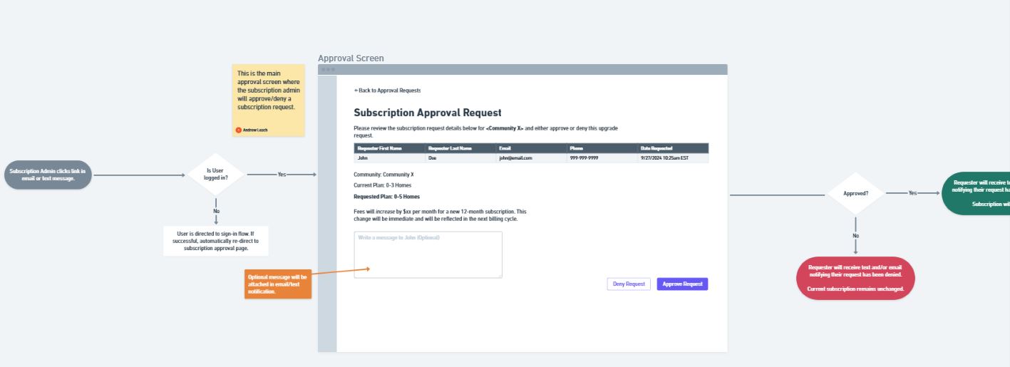
I get it, they’re not pretty. Okay, far from pretty, perhaps. That said, those ugly boxes colored in four shades of grey do serve several important purposes. They are quick to assemble, break down, and try again. There’s nothing fancy or colorful about the design to distract from what really matters at this point: The User Experience.
That’s right! As a designer, your job is to create a seamless user experience. By skipping out on wireframes, you pass up an excellent opportunity to focus 100% of your attention on designing a quality user experience without getting distracted from the colors and other micro-visual design decisions that come with mocking up the final UI.
Wireframes save designer time and, therefore, company time
Ideally, catching major UX flaws should happen before you even touch the final visual mocks. Since wireframes are so simple, they’re fast and easy to build, review the UX, tear down, and then build and iterate on again. Visual designs, even though they’re pretty looking and stakeholder ready, take longer to build. If you’ve skipped wireframes and overlooked a significant UX flaw, you run the risk of having to tear down the hours spent on your visual designs to try again. That scenario is inefficient, frustrating, and, ironically, would actually end up more expensive than deciding to invest the time in wireframes from the very beginning.
